Cepeda & Negrette Abogados is a law firm requiring a visual identity capable of communicating professionalism, trust, and institutional strength. The objective of this project was to create a timeless and distinctive brand mark that would represent the firm's values while establishing a strong and recognizable presence across its communication materials.
The Challenge
Legal services rely heavily on credibility and trust. The visual identity therefore needed to project confidence, seriousness, and professionalism while differentiating the firm from the numerous traditional law office identities commonly found within the industry.
The challenge was to develop a logo that balanced elegance and symbolism without becoming visually complex or dependent on generic legal imagery.
Concept Development
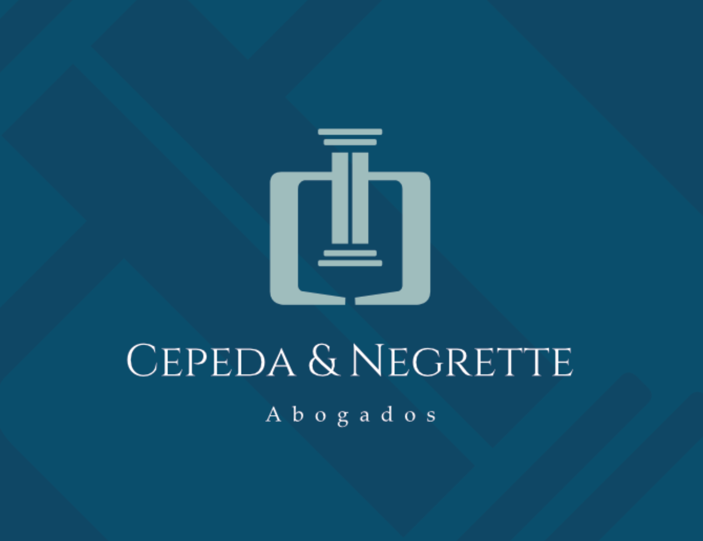
The identity was built around a custom-designed monogram that combines the initials of the firm's name into a single, robust, and symmetrical symbol.
The left side of the mark integrates the letter C, representing Cepeda, while the right side incorporates the letter N, representing Negrette. Together, these elements form a balanced geometric structure that conveys unity, collaboration, and stability.
At the center of the composition stands a classical column, one of the most enduring symbols associated with law, justice, and institutional strength. The column serves as the visual anchor of the identity, representing the role of law as a foundation that supports organizations, individuals, and society as a whole.
The result is a mark that communicates both partnership and purpose through a single cohesive symbol.
Typography Selection
The typography was carefully selected to complement the symbolism of the monogram.
Inspired by classical Roman and Latin inscriptions, the chosen letterforms evoke tradition, authority, and permanence. This historical reference reinforces the legal profession's connection to centuries of jurisprudence while maintaining a refined and contemporary appearance.
The combination of the monogram and typography creates a balanced identity that feels both established and sophisticated.


Color Strategy
The color palette was developed to reinforce the firm's positioning and professional character.
Deep blue tones were selected to communicate trust, confidence, corporate professionalism, and reliability. These qualities are essential within the legal sector, where clients seek guidance, stability, and expertise.
The contrast between the dark background and the lighter monogram further enhances visibility while adding a sense of elegance and distinction.
Design Characteristics
- Key attributes of the visual identity include:
- Custom symbolic monogram
- Strong geometric symmetry
- Timeless legal symbolism
- Classical typographic inspiration
- Professional and corporate color palette
- Versatility across digital and print applications
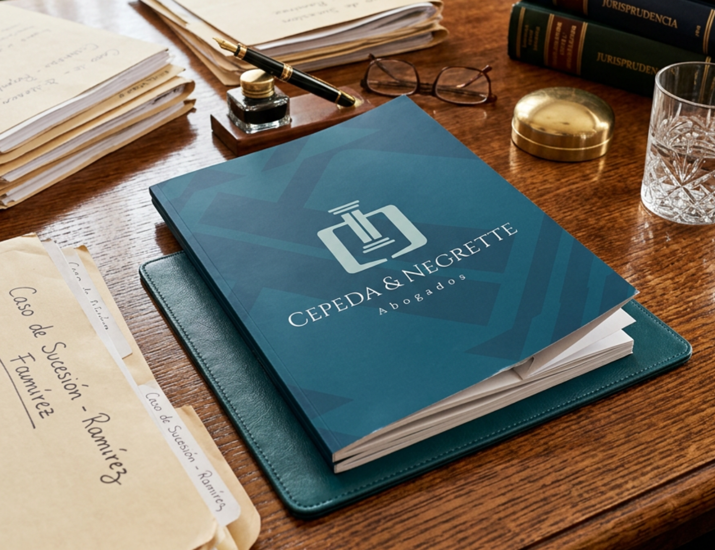
The identity was designed to perform effectively across business cards, legal documentation, websites, signage, presentations, and other professional communication materials.
Final Outcome
The final logo successfully combines symbolism, structure, and visual sophistication into a memorable brand identity that reflects the values of Cepeda & Negrette Abogados.
By integrating the initials of both partners with the imagery of a classical column, the design communicates partnership, trust, institutional strength, and legal expertise through a single distinctive mark.
This project demonstrates expertise in brand strategy, logo design, typographic selection, symbolic thinking, and the development of professional visual identities that balance conceptual depth with practical application.