
Panzerotti is a restaurant specializing in one of Italy's most beloved street foods. The objective of this project was to develop a refreshed visual identity capable of increasing brand recognition, improving visual impact, and creating a stronger emotional connection with customers, particularly younger audiences and families.
Rather than abandoning the existing brand equity, the redesign focused on evolving the original concept into a more memorable and engaging identity.
The Challenge
The original logo featured a straightforward representation of a panzerotti accompanied by a muted orange color palette. While functional, the identity lacked a distinctive personality and offered limited opportunities for storytelling or customer engagement.
The challenge was to create a bolder, more recognizable brand that would stand out in a competitive food service environment while remaining connected to the restaurant's original visual roots.
Design Strategy
The redesign was centered around the idea of transforming the product itself into the brand's ambassador.
Instead of depicting a simple food item, the new concept introduced a mascot-inspired character that could communicate friendliness, quality, and memorability at a glance.
The goal was to create a visual identity that would appeal to both adults and children while giving the restaurant a unique and recognizable face.
Character Development
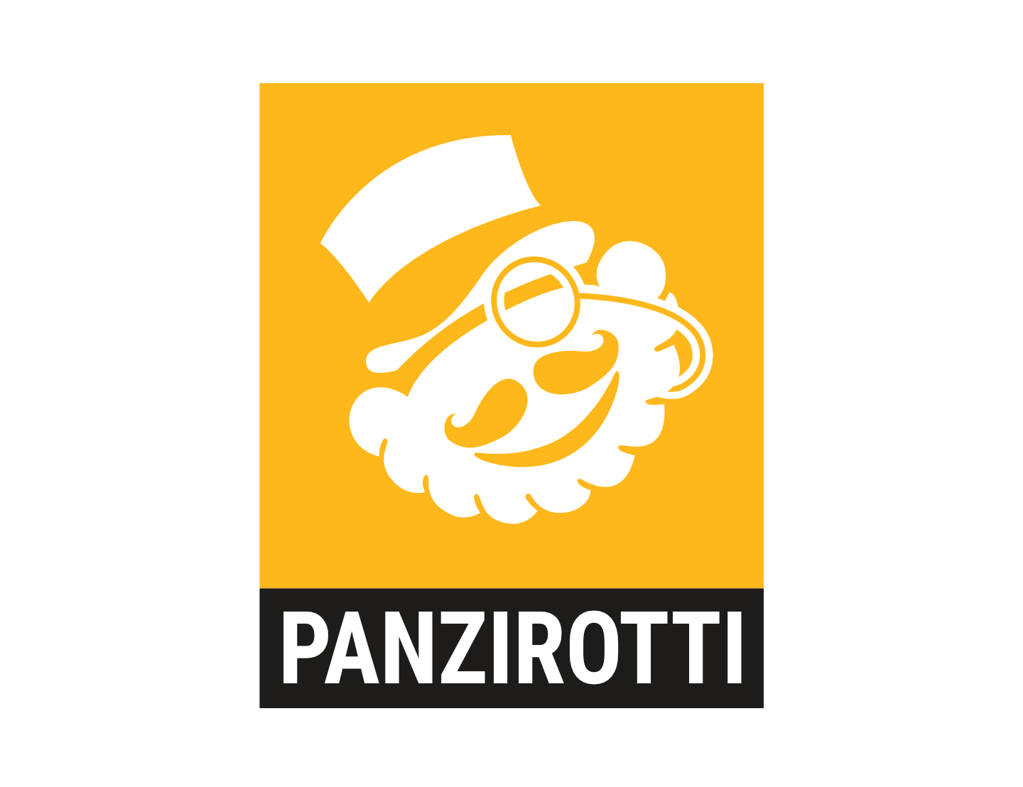
The new logo features a smiling gentleman-inspired mascot characterized by a monocle, a high-top hat, and a stylized mustache.
These elements were carefully selected to evoke craftsmanship, tradition, and personality while introducing a playful and approachable tone.
Most importantly, the character's face was constructed directly from the shape of the original panzerotti symbol, preserving a visual connection to the restaurant's previous identity.
This approach allowed the redesign to maintain continuity while significantly increasing brand distinctiveness.
Brand Personality
One of the primary objectives of the redesign was to establish a stronger emotional connection with customers.
The mascot character introduces warmth, friendliness, and recognition while helping differentiate the restaurant from competitors that rely solely on product photography or generic food icons.
By giving the brand a recognizable personality, the identity becomes more memorable and adaptable across future marketing campaigns, merchandise, social media content, and customer experiences.
Implementation
The redesigned identity was developed to function across multiple touchpoints, including:
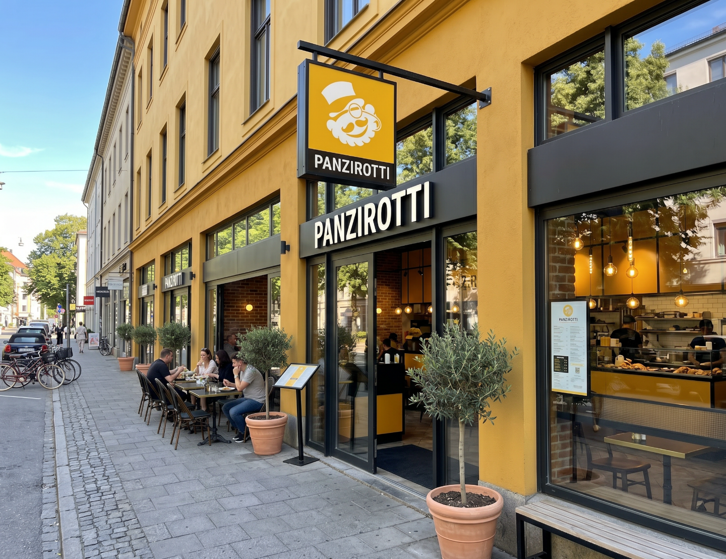
- Exterior storefront signage
- Restaurant branding
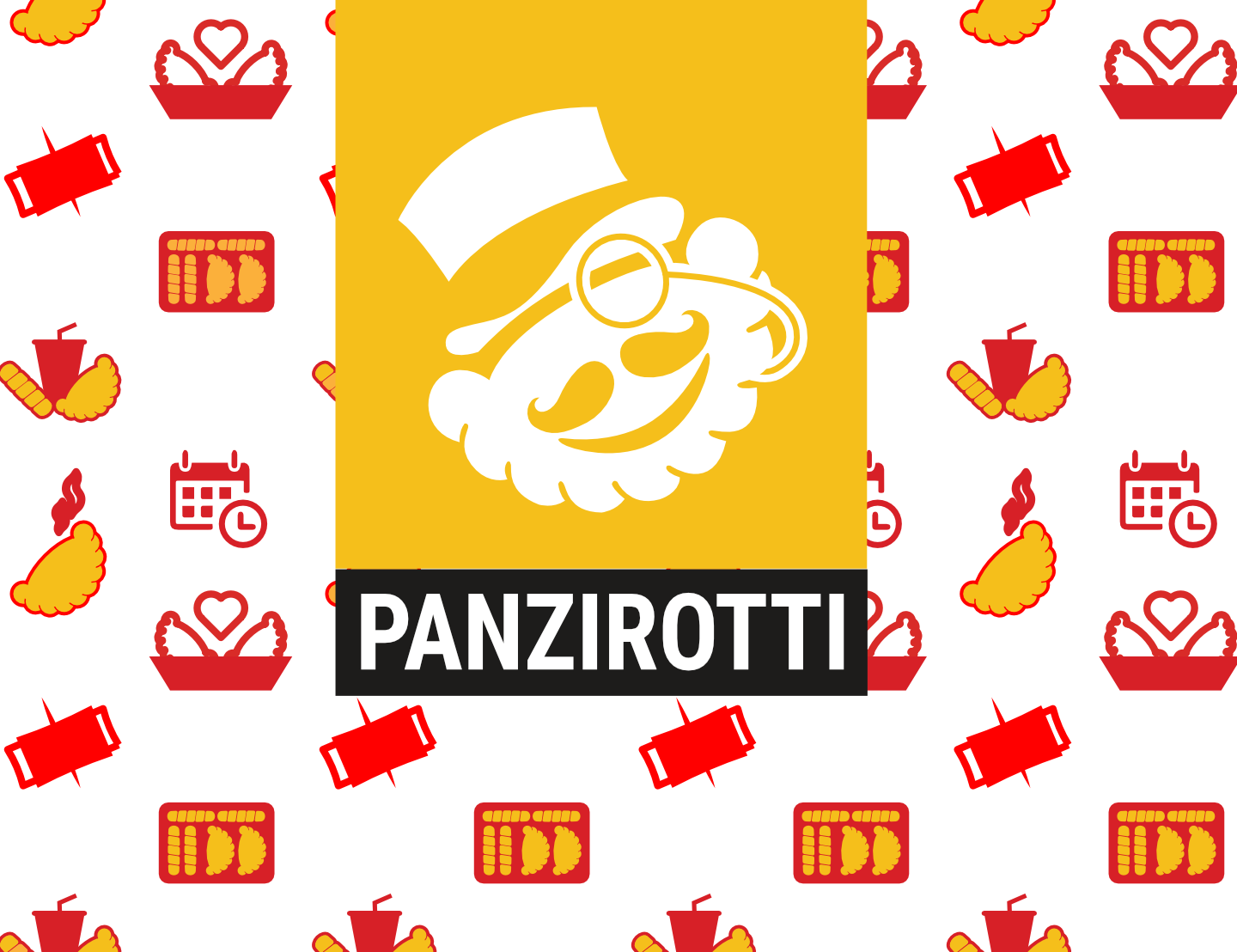
- Packaging applications
- Menus and promotional materials
- Social media graphics
- Digital marketing assets
The bold graphic style ensures strong visibility and recognition regardless of scale or application.
Final Outcome
The result is a refreshed and distinctive visual identity that successfully transforms a simple product-based logo into a memorable brand character.
By preserving the recognizable shape of the original panzerotti while introducing personality, storytelling, and stronger visual appeal, the redesign creates a more engaging brand experience capable of attracting new customers and strengthening long-term recognition.
This project demonstrates expertise in brand evolution, mascot design, visual storytelling, logo redesign, and the strategic development of food-service identities that balance familiarity with innovation.